Thursday 21 January 2016

OTS company ident

Greg has made a post on his blog which displays the ident he made.

Here is a link to the post: http: Link to post

I really like the final ident and feel that it looks great and think that the improvement on the first one due to the effect of a light bulb being lit rather than the whole lamp head. This made it feel as if the lamp were being lit rather than the whole lamp shining. This ident is very simple but fits the genre of film noir, although the bulb is yellow the rest is black and white. The lamp also fits noir film because it looks like it is from the noir time period. The rain also gives off an unsettling gloomy effect on the audience.

Below is a screenshot of Greg's post

Tuesday 19 January 2016

Fonts for OTS


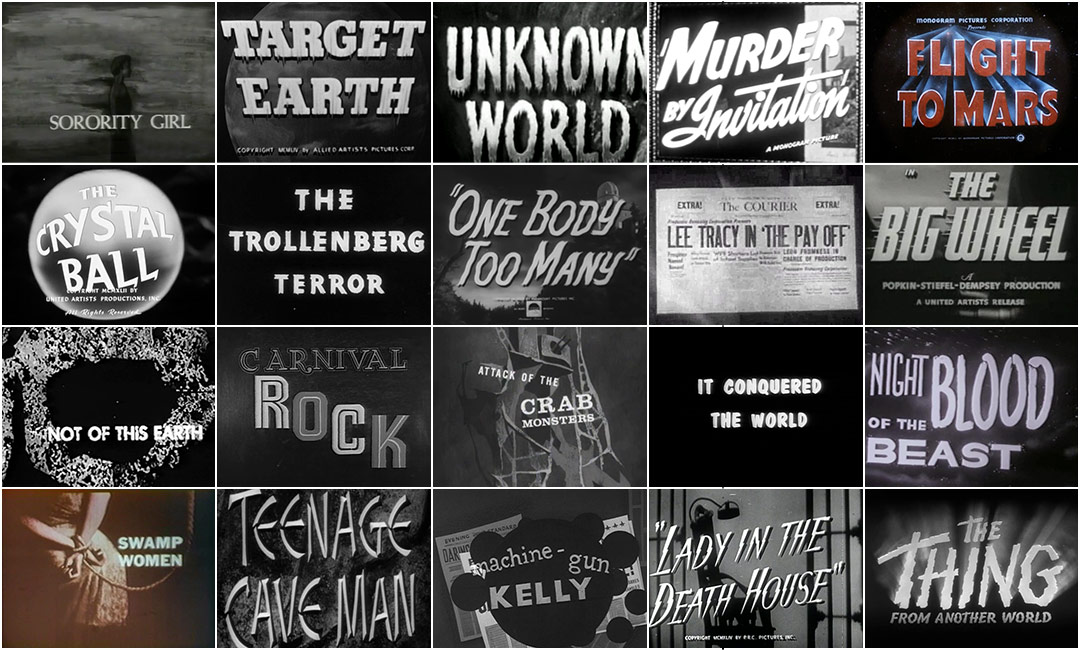
Here are a few examples of titles for noir film. We will use this to decide which fonts would be appropriate. All of these fonts have a huge impact. These also have either no colour or little colour which has large impact on the title. Most fonts are also very bold or very thin. This makes it have a huge impact on the audience because the bold text is very clear which means they can easily read it. The boldness also makes it easier to read.
This font is simple but has a large impact on the reader due to the the splatters of white which due to film noir being black and white could represent blood. This will give the audience an idea of what will happen within the film that .The font is also not very readable due to the splatters which could be a problem for the audience trying to read it depending on what is in the background of the title. This should be used in a distopian film which applies to film noir because something will go wrong. The title shows something being broken down which applies to our everyman. This font is also typical because it's bold like a majority of the titles above.
This font will have a large impact on the reader due to it's boldness and roughness. This may show the reader that our film will follow someone who's gone through lots. It is also very readable so the audience won't have trouble knowing what the film is called. This font may be typically used in an action movie because it catches attention very easily and is easy to read.

This font represents noir film because it has a fog over it which adds a sense of mystery to the title. This should set the tone of mystery for the audience and give them a hint toward the mystery of the film. This font would also be typically used in a distopian film but could represent that our everyman is being broken down and pieces of him are a blur. This font may not be very readable depending on the background behind the title. This would also be typical because it's bold like a majority of the titles in the collage above

This font is very bold and would also typically be used in a distopian film due to the parts within the text missing. This would also be appropriate because it would represent our everyman. This also gives the title some mystery due to the parts missing from the title. This font is quite unclear and hard to read  so it won't have as much impact on the audience.
This font represents the time period we want to show but is not conventional as most noir films have bold titles so that they grab your attention. This would probably be more commonly used in a romantic film set in the same time period as noir. Due to the title not being very bold the audience will have trouble reading it.

This font is traditionally used for gothic horror however we may use it for our traditional noir because it could represent that our everyman isn't a normal person. This font also isn't very bold like the ones in the collage above but I feel that it represents the time period we want to represent.


Thursday 14 January 2016

Location Examples from Noir Films

This picture is from the opening title sequence of double indemnity. This shows the sort of road we need for our noir opening title sequence. It is also set at night which maked all the lights more apparent and the figure at the front more mysterious.


This picture was taken from the trailer of 'The Black Dahlia' and shows an alleyway which is similar to what we could use for our drug exchange scene. This would be appropriate because of the old style of the buildings and also the old props such as the lamp.
This picture was taken from sin city and although it's not entirely appropriate because it's a neo noir it is relevant because of the old buildings, lamp posts, etc. The character on the bike is close to the camera with half of his face lit which could emphasise his bad side.


This image is taken from the noir film 'The Third Man.' This may be appropriate because there is a large building on an abandoned street.

This picture is from 'Double Indemnity.' This is similar to what we want for our scenes at the desk because it has appropriate props  and gives off the feel of an office. It also has light shining through the blinds which we want to create the effect of. Half of the everyman's face is darkened to create the effect of his dark side.


This picture was taken from the noir film 'The Maltese Falcon.' This is similar to what we would like for our desk because it has some old style props such as the phone, clock and lamp. The everyman in this scene is close to the camera to make the audience feel close to him and allow us to see his facial expressions


Wednesday 13 January 2016

Group Communication

We used facebook group chats to communicate outside of school. In this screenshot we were discussing the name of the production. We used the group chat so that we could give each other our opinions. The group is also helpful because it means that we can tell each other what we've done and what we're plannimg to do. We also skype quite frequently because it's even easier to discuss our ideas, thoughts and feelings.

Friday 1 January 2016

Costume in film noir research


Seeing as our group is going to produce a traditions noir film I decided to research what is most worn by the typical characters in noir film. All of the images bellow show the everyman/antihero wearing suits. This is shown to be a lighter colour than the suit that the villain wears as the villain usually wears a black suit Both the everyman and villian wear fedoras however it's not a necessity as some of the characters pictured below aren't wearing any hats at all. A majority of femme fatal's in the photos below are wearing revealing dresses and bright lipstick. Later I will be adding the costumes for our characters to this post.


This is how we decided to dress our everyman because we wanted to dress our everyman in a suit and fedora because our OTS is for a traditional noir film and this is very typical for noir film.